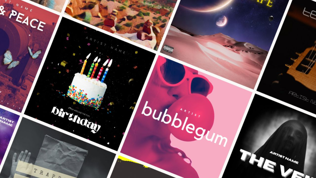
Album Cover Design Mistakes (or How to Screw Up Your Cover Art)
Album cover art can be the difference between a successful album launch and one that falls flat. Yet, even with all of the hard work put into making a great album, mistakes in album cover art design can easily ruin everything. As an artist or label, you need to know how to avoid these common pitfalls and make sure your art is up to scratch. From misunderstanding music genres to not following platform guidelines, this article will explore the mistakes made in album cover art design, why they're made, and how to avoid them. So grab your pencils and let's get creative - because no one wants to screw up their album cover art!
Definition of Album Cover Art
Album cover art is the visual representation of a music album. It's much more than just an eye-catching image - it's meant to give the listener a glimpse into what their experience with the album will be like. Album cover art typically includes artwork, photography, typography, and text that reflects the artist's style, genre of music, and overall message. From classic illustrations to abstract graphics and bold colors, album covers have become iconic symbols of music culture in their own right - so make sure yours stands out!
No matter how you decide to design your album cover art, it's important to keep in mind that the visuals should be reflective of the music and artist. With a little thoughtfulness and creativity, you can create an iconic piece of art that will be remembered for years to come! Now, let's take a look at some common mistakes to avoid when designing album cover art...
Common Mistakes Made in Album Cover Art Design
Creating album cover art is no easy task — you want to make sure it stands out, reflects the artist's style, and captures the overall message of the music. However, there are some common mistakes that should be avoided when designing your album cover art.
For starters, don't overcrowd your cover. Too many elements can detract from the overall design and make it harder for people to comprehend what they're looking at. Also be careful not to use images or text that could be potentially offensive or controversial — you want your artwork to be memorable and meaningful, not just shocking!
Additionally, you should avoid using generic stock photos or images that have nothing to do with the artist or their music. While it may seem like a good idea in theory (because it's easy), this approach likely won't capture the attention of listeners as much as something more unique and tailored will. Lastly, don't forget about typography — an important element of any album cover design! Make sure it's legible, relevant to the concept, and visually appealing.
By keeping these tips in mind while creating your album cover art, you can ensure that your final product will reflect your artistic vision and stand out from the rest!
Reasons for Making Mistakes in Album Cover Art Design
It's easy to make mistakes when designing album cover art — after all, you're dealing with a limited space and often have to convey a lot of information in a small area. But that doesn't mean you should give up! Here are some common reasons why album cover art designs can go wrong and how to avoid making similar mistakes.
First, don't be afraid to be creative. If you find yourself stuck in a rut and unable to come up with something unique, try taking risks, mixing different elements together or just having fun with it! It's also important not to overcomplicate things — keep the design simple and memorable so you can make an impact.
Lastly, don't forget about fonts and typography. This is crucial for conveying the message of your artwork; the font should be appropriate for the genre and match the overall style of your design. Be sure to choose one that stands out but is still legible!
Making mistakes in album cover art design isn't something to fear — it's part of the learning process! By avoiding these common pitfalls and embracing creativity, you can create amazing artwork that will stand out from the crowd.
Creating an album cover art design is like crafting a piece of art, so don't be afraid to experiment and take risks. By avoiding common mistakes and being creative, you can create something truly unique that will capture the essence of your music! But be warned: there can still be pitfalls if you don't understand the genre you're designing for - stay tuned to find out more...
Misunderstanding of the Music Genre
Misunderstanding of the Music Genre can be a real bummer when it comes to album cover art design. It's like trying to put together a jigsaw puzzle with pieces from two different puzzles! Unfortunately, many designers run into this problem without realizing it — they look at the music and think they know what genre it fits in, only to find out that their choices don't quite match up.
The key is to really listen to and understand the music you're designing for before diving in. Listen closely and take notes on any stylistic nuances that you hear. Is there a particular instrument or sound that stands out? Does the music have an upbeat tempo or is it more mellow? All of these details will help inform your design decisions and ensure that your artwork accurately reflects the music itself.
So if you're ever unsure about what direction to go with your album cover art design, just remember: listen first, then create! That way, you can be sure you get it right the first time around.
Lack of Understanding of The Target Audience
Lack of understanding of the target audience is a common album cover art design mistake. It's easy to get so caught up in making sure that the artwork accurately reflects the music, that designers can forget about who will actually be seeing it. The key is to take some time to think about who your music appeals to and what kind of visual elements they might respond well to.
For instance, if you're creating an album cover for a hip-hop artist, you'll want to make sure that it speaks to their core fanbase — so look out for things like graffiti-style lettering or bright colors and graphics. Alternatively, if you're creating an album cover for a folk musician, then maybe something more minimalistic and earthy would be more appropriate.
At the end of the day, it's all about finding the right visual balance between reflecting the music itself and appealing to its intended audience — but with a bit of research and consideration, you should have no problem getting it right!
Not Following Platform Guidelines
Not following platform guidelines is one of the biggest album cover art design mistakes you can make. Whether you're creating artwork for a physical release, streaming services or anything else, it's important to understand the restrictions and requirements of each platform — otherwise, your artwork might be rejected or just look out of place.
For example, if you're designing an album cover for Spotify, then you'll need to make sure that it meets their size and format requirements. And while this may sound like a small detail, failing to adhere to them could mean that your artwork ends up looking blurry or distorted on users' devices.
The best thing to do when creating artwork for any platform is to familiarize yourself with their guidelines beforehand — that way, you can avoid any potential headaches and make sure that your designs look their best!
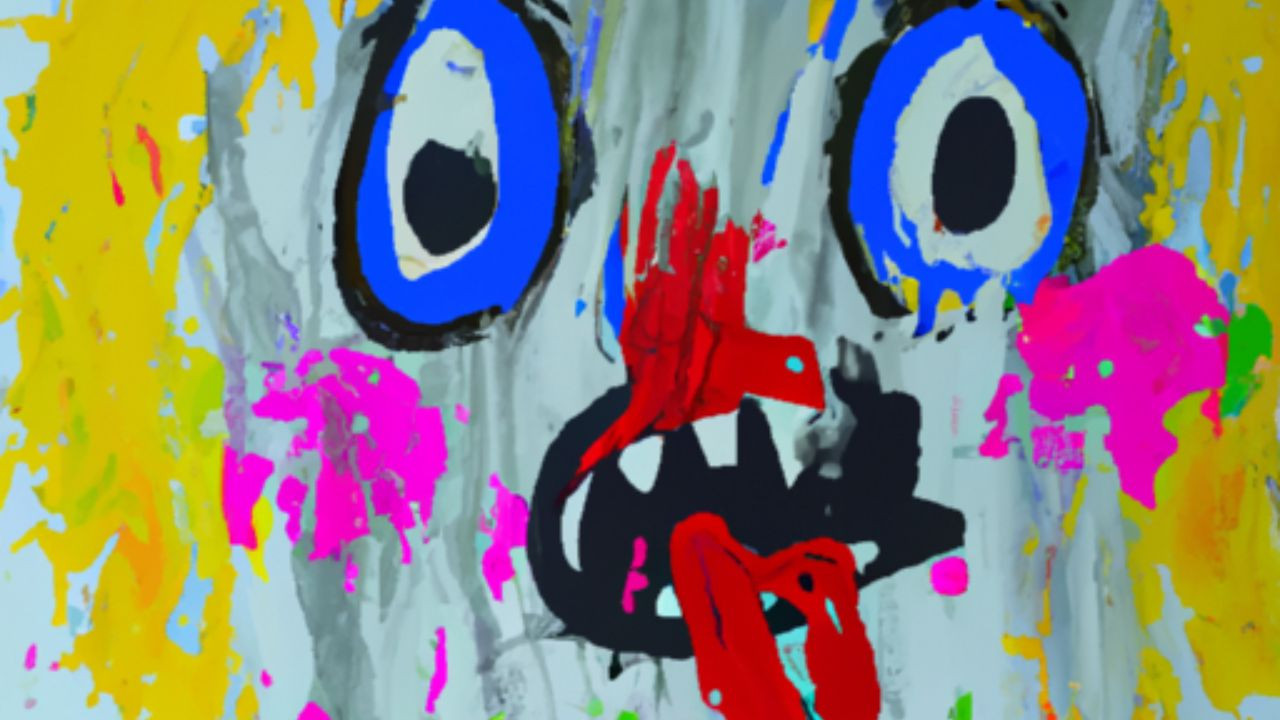
Use of Uninspired or Overused Imagery
Using uninspired or overused imagery is one of the biggest album cover art design mistakes you can make. Sure, it might seem like a good idea to use something classic or familiar — but if every other artist is doing the same thing, then your artwork won't stand out.
It's always best to be creative and original with your designs, rather than just relying on stock photos or generic images that everyone else is using. Try to think outside of the box and come up with something that truly reflects your music and vision — after all, that's what will make your artwork memorable!
And if you're really stuck for ideas, don't be afraid to get help from a professional designer — they'll have plenty of experience in creating unique and eye-catching artwork that will make sure your album stands out from the crowd!
Being a Dick...
Being a dick is never the right move. Whether you're trying to be funny, make a point, or just show off, there are better ways to go about it than being a jerk. Sure, it might seem like a good idea at first — oooh edgy, right?! — but trust us, it'll come back to bite you in the end.
What do we mean by being a dick? Being a dick means using things like copyrighted imagery, photos that you don't have consent to use, hate speech and slurs, Nazi signs, excessively violent or pornographic images on your cover art, giving false information about who's on your track…ya know, the stuff that'll get you kicked off platforms and make you look like a dick.
It's really all pretty simple. So let's all make a pact to take the extra millisecond and act like a decent human here — shall we? It'll make getting your art accepted on streaming platforms so much easier for everyone.
Unclear and Too Busy Design
Being Too Busy...
When it comes to album cover art, less is often more. Sure, you may want to cram as much information and imagery into your design as possible — but when it comes to being visually appealing or making a lasting impression, too much clutter can be the kiss of death.
If you want your album cover art to stand out, it's important to make sure that the design is both clear and concise. Trying to fit too many elements into a single image can cause confusion and make it difficult for viewers to understand what they're looking at. And when viewers don't understand what they're looking at, they tend not to appreciate it.
So keep your album cover art simple! Showcase only 1–3 key elements, limit the number of colors used, and leave plenty of negative space. This will ensure that your design looks polished and professional — and that viewers are able stay focused on its main message.
Wrong Color Combinations and Font Choices
When it comes to creating album cover art, using the wrong color combinations and font choices can really be a screw up. You want your album cover art to stand out and make an impact, but the wrong colors and fonts can take away from the overall design.
For example, many people think that neon or bright colors will grab attention — but in reality, they can actually be too distracting. Instead of drawing viewers in and making them want to look closer, they'll just turn away in confusion.
As for fonts, you don't want to use a font that is difficult to read or one that doesn't fit with the overall design. For example, if you're designing something more classic-looking, then you wouldn't want to use a font like Comic Sans — it just isn't going to feel right.
Choosing the right colors and fonts for your album cover art takes practice — so remember to experiment until you find something that looks great! Take some time to think about what color schemes or typefaces might work best for your design — and if all else fails, get another opinion!
Consequences of Making Mistakes in Album Cover Art Design
When it comes to making mistakes in album cover art design, the consequences could be disastrous. Not only will you have a poorly-designed album cover, but it could also turn people away from your project altogether.
For starters, if you make the wrong color choices or font selections, it can completely ruin the look of your artwork. People may not even recognize who the artist is or what music they're trying to promote — and if that happens, then all your hard work has gone to waste.
In addition, using cheesy visuals or low-quality images on an album cover can be another mistake that turns people off. It's important to take your time and select images that are unique and visually appealing — otherwise, you'll end up with something that looks generic and unprofessional.
Finally, don't forget about layout and composition when designing an album cover! If everything looks cluttered or disorganized, it won't make a good impression on potential fans. Aim for a clean design with plenty of white space so that each element stands out without being overwhelming.
By avoiding these common mistakes in album cover art design, you can create a visually stunning piece of artwork that will appeal to potential fans and entice them to listen to your music! And if you don't, you may face the consequences of poor reputation and low sales figures — but we'll explore that more in the next section.
Poor Reputation and Low Sales Figures
Getting a poor reputation and low sales figures from an album cover art design mistake is like getting dealt a bad hand in poker. Sure, you can try to bluff your way out of it, but eventually the truth will come out and people will see how badly you messed up.
It's not fun and it's definitely not something any artist wants to go through — but unfortunately, it happens all too often. If you don't take the time to carefully plan and create an eye-catching album cover art design, then you may end up with a product that nobody wants to buy.
So what can you do if this happens? First of all, don't panic! While there's no guarantee that you'll be able to fix the problem, there are some steps you can take to salvage your project and get back on track. For starters, look into hiring a professional graphic designer who can help give your artwork a much-needed makeover. Additionally, consider rebranding yourself or changing your image altogether — after all, first impressions are everything when it comes to promoting music.
In the end, it's important to remember that mistakes happen — but they don't have to define who you are as an artist or what kind of music you create. With some hard work and dedication, it is possible to turn things around and restore your reputation in the industry.
Damaged Relationships with Record Labels and Fans
Let's face it — not all relationships with record labels and fans run smoothly. Whether it's a disagreement over marketing strategies, the handling of a project, or the release of an album that doesn't live up to expectations, sometimes things can get messy.
But instead of getting down and out about damaged relationships with record labels and fans, why not take it as an opportunity to learn and grow? After all, no one is perfect and mistakes happen.
The important thing is to acknowledge what went wrong, apologize if necessary, and then move forward in a positive manner. Show your supporters that you care about their opinion and work hard to make sure everyone is satisfied with the end result.
At the end of the day, people want to feel like they are part of something bigger than themselves — so don't forget to show them some love! Engage with them on social media platforms, thank them for their continued support, or even send out some cool merchandise every now and then.
By taking responsibility for your actions and putting in extra effort to maintain healthy relationships with record labels and fans alike, you'll be able to create a loyal fanbase who will stick around for many years to come.
How To Avoid Making Mistakes in Album Cover Art Design
So now we know that creating album cover art can be a daunting task. It's like trying to capture the essence of your music in an image and it has to be eye-catching enough to draw people in.
And maybe all this talk about screwing it up has got you feeling a bit unsure, so sorry about that. But don’t worry, we're going to close with a little bit of knowledge you can use to make sure that your album cover art design is top notch!
First, let's start with the basics. Avoid using overly complicated designs or incorporating too many elements into the artwork. Keep it clean and simple - this will help to ensure that the focus remains on your music.
Second, steer clear of cliché visuals such as skulls, flames, and graffiti fonts. These are all overused tropes and they won't do anything to help make your music stand out from the crowd.
Third, try not to get too creative with the colors you use. Stick to one or two primary colors alongside a few accent shades. This will create a cohesive look without becoming overwhelming for viewers.
Finally, when creating album art designs always remember that less is more! Don't go overboard trying to cram as much information into one image as possible – instead focus on conveying the mood of your music while still keeping things visually appealing.
At the end of the day, creating great album cover art doesn’t have to be difficult if you keep these tips in mind!
Ready to get started? Create an epic cover art design in minutes with our AI Cover Art Generator!
Comments (0)
No comments found